Color is never just color. It sets the mood. Shapes the vibe. Decides whether guests lean in or check out.
And here’s the thing in 2025. Event design isn’t playing it safe. It’s going bold, experimental, sometimes even risky.
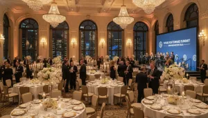
Weddings, corporate galas, product launches… The colors you choose now matter more than ever.
So what’s showing up across New York’s luxury events?
What’s Trending This Year
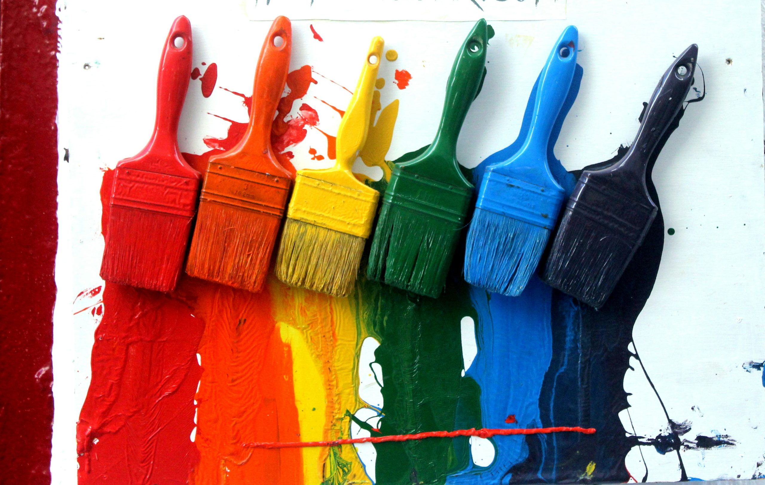
You’re not stuck with beige and blush anymore. Three directions are stealing the spotlight:
- Vibrant neons that scream energy. Think electric lime, hot pink, neon orange. Perfect when you want a party that buzzes from the moment doors open.
- Earthy neutrals that whisper calm. Warm taupe, olive green, muted terracotta. You see them grounding corporate gatherings and bringing intimacy to upscale weddings.
- Futuristic metallics that polish everything with edge. Chrome, rose gold, iridescent accents. A favorite for tech launches and high-profile showcases where “wow factor” is non-negotiable.
The smartest planners don’t pick just one lane. They layer. Neon with neutrals. Metallics with muted tones. Balance is where the magic lives.
Why It Matters
Colors aren’t just pretty. They shape behavior.
Bright neons? They push people to talk, dance, network harder.
Neutrals? They calm a room, keep energy steady during long conferences or heartfelt vows.
Metallics? They add a sheen of sophistication that photographs beautifully and screams modern luxury.
Ignore this and you risk a flat event. Nail it and you control the entire guest experience without saying a word.
Bringing It to Life
Here’s where it gets practical.
- Corporate events: Keep it grounded with neutrals, metallic signage, and maybe some neon highlights on stage visuals.
- Luxury weddings: Lean into earthy tones for intimacy, sprinkle in rose gold on tabletops, then surprise guests with neon lighting when the reception starts.
- Launch parties: Try heavy neons and metallics. Let neutrals in the background. You want guests posting photos that scream buzz and innovation.
Lighting is your partner in crime here. Test palettes in your venue, because taupe in daylight can look stunning, but under LED it might feel muddy.
Quick Tips for Planners
- Match the mood to the event’s purpose.
- Test swatches in the actual space, not just on a vision board.
- Don’t overdo neons. Use them like exclamation points, not the whole sentence.
- Blend trends. One-note palettes feel flat in 2025.
Choosing color isn’t about filling a mood board. It’s about designing the emotional arc of an event.
When you mix neons, neutrals, and metallics with intention, you set the stage for experiences guests won’t forget.
Because in New York, in 2025, people aren’t just coming for the food or the speakers. They’re coming for the feeling. And color is how you get them there.
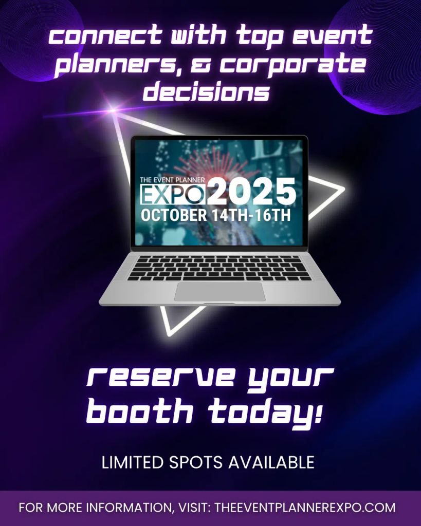
See It All Come Alive at The Event Planner Expo 2025
Reading about color is one thing. Seeing it play out across full-scale productions is another.
At The Event Planner Expo 2025, you’ll walk the floor and watch how top designers, florists, and production teams in New York are using these palettes in real time.
It’s not just inspiration. It’s strategy. You’ll connect with decision-makers, spot what’s next before your competitors do, and leave with ideas you can put to work immediately.If you’re serious about staying on top of the event scene, this is the place you need to be. Grab your spot now, because the trends you’ll see here will define 2025 and beyond.