In a world of endless emails and fleeting social media posts, a physical brochure offers something different: a tangible connection. It’s a piece of your event that someone can hold, share, and refer back to, cutting through the digital clutter in a way a screen just can’t. A well-designed event marketing brochure does more than just list dates and times; it tells your event’s story, builds excitement, and communicates the value you offer. It’s a versatile tool that can attract attendees, inform guests on-site, and even help secure high-value sponsors. This guide will walk you through creating a brochure that not only looks fantastic but also serves as a powerful, effective piece of your marketing strategy.
Key Takeaways
- Nail the fundamentals with clear info and strong design: A great brochure answers all the key questions about your event and presents them in a visually compelling package that makes your brand look professional and trustworthy.
- Combine persuasive copy with engaging visuals: Use powerful headlines and benefit-driven descriptions to sell the experience, not just list features. Support your message with modern design elements like bold colors and clean layouts to create a brochure that feels current and is easy to read.
- Make it easy to act and measure the impact: Every brochure needs a clear call to action that tells people exactly what to do next. Use trackable tools like QR codes or unique promo codes to directly link your print marketing to registrations and prove its value.
What Is an Event Brochure (And Why You Still Need One)
In an age of digital everything, you might wonder if a printed brochure is still relevant. The answer is a resounding yes. Think of an event brochure as a physical handshake—it’s a tangible piece of your brand that someone can hold, take with them, and refer back to later. It’s a simple and flexible way to share information about your event, whether you’re trying to attract attendees, inform current guests, or secure sponsors.
Unlike a fleeting social media post or an email that gets buried in an inbox, a well-designed brochure has staying power. It serves as a mini-guidebook, giving people a snapshot of what to expect and why they absolutely can’t miss out. A great brochure needs to look fantastic and share important information clearly, making a strong first impression that lasts long after the initial glance. It’s your chance to tell your event’s story in a concise, visually appealing format that cuts through the digital noise and connects with your audience on a personal level.
How Brochures Fit Into Your Marketing Plan
Your event brochure isn’t just a standalone piece of paper; it’s a strategic tool in your overall marketing plan. Before you even think about design, you need to know who you’re talking to. Identifying your target audience helps you focus your marketing efforts on those most likely to be interested in your event. This ensures your message resonates and your resources are used effectively. Your brochure’s tone, design, and content should all speak directly to that specific group.
Once you know your audience, you can use your brochure to captivate them, increase attendance, and leave a lasting impression. It’s the perfect medium for highlighting your event’s unique value proposition. Are you featuring world-class speakers? Is it an exclusive networking opportunity? Put that front and center. A brochure can be handed out at trade shows, included in direct mail campaigns, or placed in strategic locations to catch the eye of your ideal attendee.
Benefits for Planners and Attendees
For event planners, a brochure is a powerful asset. It gives you complete control over your event’s narrative, allowing you to present key information exactly how you want. A successful event brochure needs to be both eye-catching and full of useful information, from schedules and maps to speaker bios and sponsor highlights. It’s a professional touch that shows you’ve thought through every detail of the attendee experience, building credibility and excitement before the event even begins.
From an attendee’s perspective, a brochure is incredibly practical. It’s a quick reference guide they can carry with them, eliminating the need to constantly pull out their phone to check the schedule. When attendees feel that the event speaks directly to their needs and interests, they’re more likely to engage actively and network with others. A thoughtful brochure contributes to this feeling, making guests feel valued and well-informed, which ultimately creates a more dynamic and interactive environment for everyone.
Key Elements Every Event Brochure Must Have
A great brochure does more than just list facts; it tells a story and creates excitement. To make sure yours hits the mark, you need to balance compelling design with crystal-clear information. Think of it as your event’s first impression. Let’s break down the essential components that will make your brochure a powerful marketing tool, from the must-have details to the final call to action that gets people to register.
Nail Down the Event Details
Before you get into creative design, you have to cover the basics. Your brochure’s primary job is to inform, so the core details need to be impossible to miss. Clearly state the event name, date, time, and venue address. Think of the five Ws: who, what, when, where, and why. Why should someone attend? What makes your event special? Use bold text or a contrasting color to make this key information pop. You should also include contact information, like a website or phone number, so potential attendees can easily find answers to their questions. A well-organized event schedule can also be a huge draw, giving people a concrete look at the value they’ll receive.
Create a Strong Visual Design
People are visual creatures. A wall of text won’t capture anyone’s attention, but striking visuals will. Use high-quality, professional photos or graphics that reflect the energy and theme of your event. Avoid generic stock photos whenever possible; unique imagery makes your event feel more authentic and memorable. Your design should guide the reader’s eye through the brochure, from the attention-grabbing headline to the final call to action. A clean layout, readable fonts, and a cohesive color palette are non-negotiable. Think about how your top exhibitors present themselves—their visuals are sharp, professional, and on-brand. Your brochure should meet that same standard.
Align Your Branding and Message
Your brochure is an extension of your brand, so consistency is key. Use your company’s logo, brand colors, and fonts throughout the design to build brand recognition. This ensures that when someone sees your brochure, they immediately connect it to your event. Your messaging should be just as consistent. Clearly communicate what your event is about, who it’s for, and what problem it solves. What makes your event different from others? Define your unique value proposition and state it clearly. This helps attract the right audience and sets clear expectations, ensuring everyone who attends feels like they’re in the right place.
Include a Clear Call to Action
You’ve captured their attention and given them all the important details—now what? You need to tell your audience exactly what to do next with a clear and compelling call to action (CTA). Don’t leave them guessing. Use strong, action-oriented language like “Register Now,” “Book Your Spot,” or “Learn More.” Place your CTA in a prominent spot where it’s easy to see. To make the offer even more appealing, consider creating a sense of urgency with an early-bird discount or a limited-time offer. Make the next step as simple as possible by including a QR code or a direct link to your registration page.
Choose the Right Brochure Format and Size
Once you have your core message and visuals, it’s time to think about the physical or digital package they’ll come in. The format, size, and medium you choose are more than just logistical details—they shape how attendees interact with your information and perceive your event. A well-chosen format guides the reader through your event’s story, while the right size ensures it’s convenient and impactful. Making the right choices here ensures your design is both beautiful and effective, turning a simple piece of marketing into a powerful tool for driving registrations.
Tri-Fold, Bi-Fold, or Single Sheet?
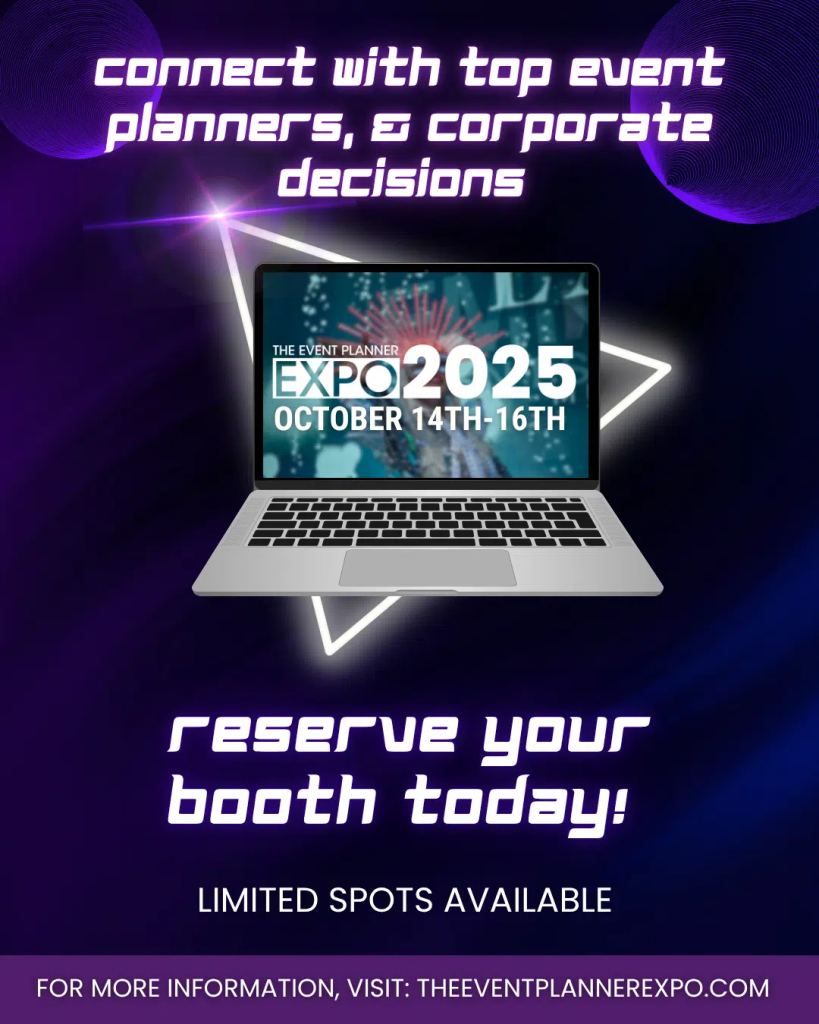
The way your brochure folds creates a narrative flow, revealing information piece by piece. The most common formats are the bi-fold (a single fold creating four panels) and the tri-fold (two folds creating six panels). A bi-fold works well for simpler events with a straightforward schedule, offering a clean, book-like experience. For a multi-day conference with many speakers and sessions, like The Event Planner Expo, a tri-fold or a z-fold gives you the extra real estate you need to organize complex details without overwhelming the reader. Think about how much content you have and choose a fold that gives your design room to breathe and tells your story in a logical sequence.
Understand Standard Sizes and Their Uses
While you can create a brochure in any custom size, sticking to standard dimensions is often more practical and budget-friendly for custom brochure printing. The most common size is a standard letter sheet (8.5″ x 11″) folded into a bi-fold or tri-fold brochure. Larger formats can make a bold statement and stand out on a table full of marketing materials, but smaller, pocket-sized brochures are convenient for attendees to carry with them. Your choice should align with your distribution plan. Will it be mailed, handed out at a trade show, or placed in a welcome bag? The right size enhances both readability and portability, making sure your message actually gets seen.
Decide Between Digital and Print
You don’t have to choose just one. Print brochures offer a tangible connection that digital formats can’t replicate. The feel of high-quality paper can convey luxury and importance, making them perfect for VIP events or sponsor packets. On the other hand, a digital brochure is incredibly versatile. You can easily share it via email or social media, and it can include interactive elements like links to your registration page, speaker videos, or venue maps. Digital formats also allow you to track engagement, giving you valuable insight into what content resonates most with your audience. Many planners use both—a digital version for broad outreach and a print version for key, high-touch moments.
Find the Best Design Tools for Your Brochure
You don’t need a degree in graphic design to create a stunning brochure. The right software can make all the difference, turning a daunting task into a creative one. Your choice of tool depends on your design experience, budget, and how much control you want over the final product. Whether you’re a beginner looking for a simple drag-and-drop solution or a pro needing pixel-perfect precision, there’s a tool that will work for you. Let’s look at the most popular options.
Canva: Perfect for Getting Started
If the thought of designing from a blank screen feels intimidating, Canva is about to become your best friend. It’s an incredibly user-friendly design tool that offers a massive library of templates specifically for brochures. This makes it easy for anyone to create something visually appealing without needing advanced graphic design skills. Its drag-and-drop interface lets you easily add your own text, logos, and images. Plus, with access to countless stock photos and graphics, you can build a professional-looking brochure in a fraction of the time. Canva is perfect for event planners who need to produce beautiful materials quickly and efficiently.
Adobe InDesign: For a Professional Polish
For those who want complete creative control and a truly polished final product, Adobe InDesign is the industry standard. As a powerful desktop publishing software, it allows for precise control over every element, from layout grids to typography. This makes it ideal for creating professional-quality brochures that require a high level of detail and customization. While InDesign has a steeper learning curve, it’s the go-to for professional designers for a reason. If your event brochure needs to be absolutely perfect for print and reflect a high-end brand, mastering this tool is a worthwhile investment for your team.
Use Templates and Customization Tips
No matter which tool you choose, templates can be a huge time-saver. Utilizing them can significantly streamline the design process, allowing you to focus on the fun part: customizing elements like colors, fonts, and images to align with your brand identity. Think of a template as your foundation, not the finished house. Always swap out generic content with high-resolution photos from your past events, apply your brand’s color palette, and use your specific fonts. The best templates are flexible and allow for easy adjustments, ensuring your brochure stands out while clearly communicating all the essential information.
Write Copy That Converts
A stunning brochure design will catch someone’s eye, but it’s the words inside that will convince them to register. Your copy needs to be clear, compelling, and focused on the value your event provides. Think of it as a direct conversation with your ideal attendee—every word should guide them from curiosity to commitment. Let’s break down how to write copy that not only informs but also inspires action.
Craft Headlines That Grab Attention
Your headline is your first—and sometimes only—chance to make an impression. It needs to stop people from tossing your brochure aside. A great headline grabs attention quickly and clearly states your main message. Use strong, active words that convey excitement and benefit. Instead of a generic title like “Annual Tech Conference,” try something like, “Where Tech’s Top Leaders Build the Future.” You can also pose a question that speaks to a pain point, such as, “Ready to Triple Your Event ROI?” The goal is to make the reader feel like they must know more. Your headline sets the tone for the entire brochure, so make it count.
Write an Event Description That Sells
Once you have their attention, your event description needs to hold it. This is where you move beyond the basic details and sell the experience. A good brochure needs to look great, but it also has to share important information clearly and persuasively. Don’t just list what the event is; explain why someone should attend. What problem does it solve for them? What will they learn? Who will they meet? Frame your event as the solution they’ve been looking for. Use bullet points to highlight key takeaways, like “Forge partnerships with industry leaders” or “Master the latest event marketing tools.” Keep your paragraphs short and focused on the value for the attendee.
Showcase Your Speakers and Agenda
Your speakers and session topics are often the biggest draws for an event. This section of your brochure is where you build credibility and generate excitement. Tell readers what you offer, who it’s for, and why it’s better than other events. Feature your most influential keynote speakers with professional headshots and a brief, powerful bio highlighting their expertise. Don’t just list session titles; add a short, compelling description for each one. Group sessions into tracks to help attendees see a clear path for their professional development. This shows you’ve curated a thoughtful and valuable program designed specifically for their needs.
Clarify Registration Details and Deadlines
After you’ve built excitement, you need to make it incredibly easy for people to act. This final section should be the clearest part of your brochure. Always include essential details like the event date, location, and website. Make this information stand out with bold text or a different color. Clearly outline ticket prices, including any early-bird discounts or group rates, and specify the deadlines for each. This creates a sense of urgency. Use a direct call to action, like “Register Now to Secure Your Spot” or “Get Your Early-Bird Ticket Today.” Providing a QR code that links directly to your registration page can make the process seamless.
Stay Current with These Design Trends
A brochure is more than just paper and ink; it’s a physical representation of your event’s brand and energy. Just as fashion and technology evolve, so do design aesthetics. Using a modern design shows your audience that your event is current, relevant, and forward-thinking. An outdated design, on the other hand, can unintentionally signal that your event is behind the times. You want your brochure to feel fresh and exciting from the moment someone picks it up.
Staying on top of design trends helps you create marketing materials that resonate with today’s audiences and stand out in a crowded marketplace. You don’t need to overhaul your entire brand identity, but incorporating a few contemporary elements can make a significant difference. It shows you pay attention to detail and are invested in creating a high-quality experience. The most successful exhibitors know that great design is a powerful tool for capturing attention and communicating value. Let’s look at a few key trends you can use to make your brochure feel modern and compelling.
Use Bold Colors and Gradients
Don’t be afraid of color. One of the most effective ways to make your brochure pop is by using bright, bold colors. Muted and overly corporate color schemes can fade into the background, but a vibrant palette demands attention. Think about using an electric accent color from your brand guide or creating a dynamic, eye-catching background with a smooth gradient. These choices create a strong visual impact and can evoke the specific energy of your event—whether it’s high-tech and innovative or celebratory and fun. A great color palette tool can help you find complementary shades that feel both exciting and professional.
Embrace Minimalism and White Space
Sometimes, the most powerful design choice is saying less. The principle of “less is more” is a major trend for a reason: it works. Minimalism uses clean layouts and ample white space (also called negative space) to create a design that’s easy to read and visually calming. Instead of overwhelming attendees with text and images, a minimalist approach allows your most important information to stand out. This shows confidence in your message. Use white space strategically to guide the reader’s eye to your headline, key speakers, or call to action. It makes your brochure feel sophisticated, organized, and respectful of the reader’s time.
Play with Modern Fonts and Layouts
Typography is a core element of your event’s personality. While classic fonts are always safe, mixing and matching more contemporary typography can give your brochure a fresh, modern feel. Try pairing a clean, readable sans-serif font for body copy with a more expressive or elegant font for your headlines. You can find thousands of high-quality, free-to-use options in libraries like Google Fonts. Similarly, don’t feel locked into a rigid, symmetrical layout. Experimenting with asymmetrical designs can create visual interest and a dynamic flow, leading the reader through the information in a more engaging way. Just be sure that creativity never comes at the expense of readability.
Select the Best Printing Options
Your brochure’s design might be perfect, but the final print quality is what brings it to life. The paper, the finish, and the crispness of the fold are the first things a potential attendee will notice when they hold it in their hands. This tangible experience is a direct reflection of your event’s quality and attention to detail. Getting the printing right ensures your hard work on the design pays off and makes the right impression. It’s the final step that turns a digital file into a powerful marketing tool that people will want to keep. As you prepare to go to print, think through your paper stock, any special finishes, and your budget to make sure the final product aligns with your event’s brand and goals.
Choose Your Paper and Printing Service
The paper you choose says a lot about your event before anyone reads a single word. A glossy finish can feel modern and energetic, perfect for a tech conference or product launch. Matte paper offers a more subdued, sophisticated feel, ideal for a corporate summit or an exclusive gala. You can also consider uncoated or recycled paper to convey an organic or eco-conscious brand identity. Before you commit, ask your printing service for samples. Feeling the different weights and textures will help you make a choice that truly represents your event. A good custom brochure printing service can guide you through these options and help you find the perfect fit.
Consider Quality and Special Finishes
Little details can make a big difference in how professional your brochure feels. To give it a memorable, high-end touch, think about adding a special finish. A spot UV coating can make your logo or key images pop with a selective shine, while embossing or debossing adds a tactile, three-dimensional element that invites people to touch it. These finishes signal a premium experience. Also, confirm with your printer that your brochures will arrive pre-folded. This not only saves you a ton of manual labor but also ensures every fold is perfectly crisp and professional, making them ready for distribution the moment they arrive.
Plan Your Budget and Print Quantity
Managing costs is a constant challenge for event professionals, so it’s important to be strategic with your print budget. Before placing an order, map out exactly how many brochures you’ll need. Think about your distribution plan: will they be mailed, handed out at trade shows, or placed in specific locations? Over-ordering wastes money and resources, while under-ordering can lead to missed opportunities. Base your print quantity on realistic attendance goals and marketing reach. Planning this carefully helps you manage the rising costs of organizing events and ensures every dollar you spend on printing is effective.
Distribute Your Brochure Effectively
Once you’ve designed a beautiful brochure, the next step is getting it into the right hands. A great design won’t drive registrations if it’s sitting in a box. Your distribution strategy should be just as thoughtful as your creative process, combining physical and digital tactics to reach your audience wherever they are. Think of it as creating multiple pathways that all lead back to your event. Here’s how to make sure your brochure makes an impact.
Plan Your Physical Distribution
For your print brochures, think strategically about location. Where does your ideal attendee spend their time? Place stacks in high-traffic spots like local coffee shops, co-working spaces, or community centers. You can also form partnerships with other businesses that serve a similar audience and ask to leave your brochures at their front desk. At industry events, having a brochure to hand someone is a tangible way to continue the conversation. It’s a physical reminder of your event that can’t be easily closed like a browser tab.
Share Digitally and on Social Media
Your print brochure can have a powerful second life online. Convert your design into a high-quality PDF or an interactive digital flipbook and share it across all your channels. Attach it to personalized email campaigns for your subscriber list, or feature it prominently on your website’s homepage. On social media, you can share direct links to the digital version in your posts or add it to your bio. Make sure the file is optimized for mobile viewing, as many people will open it on their phones. A seamless digital experience ensures your message is clear and accessible, no matter the device.
Integrate QR Codes and Tech
Bridge the gap between your physical brochure and your digital presence with technology. Adding a QR code to your print design is a simple yet effective way to guide potential attendees to take the next step. Instead of just linking to your homepage, direct them to a specific, high-value destination. This could be your registration page, a detailed agenda, or a compelling video message from one of your keynote speakers. By using trackable links with your QR code, you can gather valuable data on how many people are scanning your brochure, giving you clear insight into its effectiveness.
Avoid These Common Brochure Mistakes
After putting so much effort into planning your event, the last thing you want is for your brochure to fall flat. A great brochure can be a powerful tool, but a few common missteps can send it straight to the recycling bin. The goal is to create something that looks professional, is easy to read, and clearly communicates the value of your event. By sidestepping these frequent mistakes, you can ensure your brochure effectively captures attention and drives registrations. Let’s walk through the three biggest pitfalls and how you can steer clear of them.
Design Choices That Hurt Readability
A beautiful design is useless if no one can read it. One of the most common mistakes is prioritizing style over substance, resulting in a brochure that’s hard to decipher. Avoid using tiny fonts that require squinting or choosing color combinations with low contrast, like light gray text on a white background. Your design should guide the reader’s eye, not challenge it. A great way to improve readability is by using plenty of white space. This negative space gives your content room to breathe, preventing the layout from feeling cramped and overwhelming. A clean, organized visual hierarchy helps people quickly find the most important information.
The Problem of Information Overload
It’s tempting to pack every single detail about your event into your brochure, but this often does more harm than good. When faced with a wall of text, most people won’t read any of it. Your brochure isn’t an encyclopedia; it’s an invitation. Focus on the essential information: what the event is, who it’s for, where and when it is, and what the main highlights are. Use bullet points and short paragraphs to keep the copy scannable. You can always direct people to your website for more details. For example, instead of listing every session, highlight a few keynote speakers and link to the full online schedule.
Using Low-Quality Images or Materials
The quality of your brochure is a direct reflection of the quality of your event. Using blurry, pixelated images or generic stock photos makes your event seem unprofessional and poorly planned. Invest in high-resolution photos of past events, professional headshots of your speakers, or curated stock images that align with your brand. The same principle applies to the physical materials. Printing on flimsy, cheap paper can undermine your message. Choosing a quality paper stock with a nice finish shows you care about the details and gives potential attendees confidence in the event you’re producing. Your brochure is a tangible piece of your brand, so make it feel valuable.
Measure Your Brochure’s Success
Once your brochures are out in the world, your work isn’t quite done. The final step is to figure out if they actually worked. Measuring your brochure’s impact helps you understand what resonated with your audience and gives you concrete data to plan even better marketing materials for your next event. Without tracking, you’re just guessing.
Think of it this way: you put so much effort into crafting the perfect message, design, and call to action. Now it’s time to see how people responded. Did they visit your website? Did they register for your event? Did they use that special discount code? Answering these questions is key to refining your strategy and proving the value of your marketing spend. It’s not just about counting how many brochures you handed out; it’s about understanding the actions they inspired. This data is your roadmap for future success, helping you make smarter decisions and create campaigns that deliver real results.
Find the Right Tracking Methods
To understand your brochure’s performance, you need to connect your physical marketing with digital analytics. One of the easiest ways to do this is with QR codes. Create a unique QR code specifically for your brochure that links to a dedicated landing page on your website. This allows you to see exactly how many people scanned the code and what they did next.
Beyond QR codes, you can gather valuable qualitative data. Consider sending a post-event survey to attendees asking how they heard about your event. You can also conduct short interviews with a few attendees or partners to get more detailed feedback. These methods give you rich insights that numbers alone can’t provide, helping you understand the why behind the data and what truly motivated people to show up.
Attribute Registrations to Your Brochure
The ultimate goal is to know how many registrations came directly from your brochure. A great way to track this is by printing a unique URL or a special promotional code on the brochure. For example, you could offer a small discount for people who register now using the code “BROCHURE10.” This creates a direct, trackable link between the printed material and a completed registration.
Another simple yet effective method is to add a “How did you hear about us?” field to your registration form with “Brochure” as one of the options. While it relies on attendees to self-report, it provides a clear indicator of your brochure’s reach. Combining these tactics gives you a more complete picture of how your print marketing is driving ticket sales.
Assess Your Return on Investment
Finally, it’s time to look at the big picture: your return on investment (ROI). This goes beyond just ticket sales. Start with the quantitative data—how many people registered using your brochure’s code or link, and what was the total revenue generated from those sales? Compare that against the cost of designing and printing the brochures to calculate your direct financial ROI.
But don’t stop there. Consider the qualitative wins, too. Did the brochure help you attract high-value attendees or secure new sponsors? Did it generate social media buzz? Achieving your predefined goals, whether they were brand awareness, lead generation, or attendee engagement, is a huge part of your event’s success. A comprehensive view of ROI includes both the hard numbers and the strategic value your brochure delivered.
Frequently Asked Questions
Is a printed brochure really necessary when I already have a website and social media? Think of it this way: your digital marketing is a conversation, but a printed brochure is a handshake. It’s a tangible piece of your event that someone can hold onto, pin to their bulletin board, or pass along to a colleague. While a website is essential for deep-dives, a brochure serves as a powerful, focused summary that cuts through the digital noise and makes a lasting physical impression. It complements your online efforts by providing a professional, portable snapshot of your event’s value.
I’m not a designer. How can I create a professional-looking brochure without a big budget? You absolutely don’t need to be a graphic designer to create something beautiful. Tools like Canva were made for this exact situation. They offer thousands of professionally designed templates that you can easily customize with your own branding, text, and images using a simple drag-and-drop interface. Start with a template that catches your eye, then swap in your event’s colors, fonts, and photos to make it your own. This approach saves you time and money while still producing a polished, high-quality result.
What’s the single biggest mistake to avoid when creating an event brochure? The most common pitfall is information overload. It’s easy to fall into the trap of trying to cram every single detail about your event onto one piece of paper. A brochure should be an invitation, not an encyclopedia. When readers are faced with a wall of tiny text, they tend to shut down and read nothing at all. Focus on the most compelling highlights—your keynote speakers, the unique value proposition, and a clear call to action. Your goal is to spark interest and guide them to your website for the full story.
How do I decide between a simple bi-fold and a more complex tri-fold brochure? The right format really depends on the amount of information you need to share. A bi-fold, which has four panels, is perfect for events with a straightforward message, like a single-day workshop or a gala. It provides a clean, book-like feel. A tri-fold, with its six panels, is better suited for more complex events like a multi-day conference. It gives you more space to neatly organize different sections, such as a detailed agenda, speaker bios, and sponsor information, without making the design feel cluttered.
How can I make my brochure more interactive and actually track its effectiveness? The best way to connect your print brochure to your digital world is with a QR code. Instead of just linking to your homepage, create a unique QR code that sends people to a specific destination, like your registration page or a video from a past event. You can also include a special discount code exclusive to the brochure, like “BROCHURE10.” Both of these methods are easily trackable, allowing you to see exactly how many people took action directly from your printed materials.
If you’re serious about positioning your brand in front of decision-makers who value this level of thinking, reserve your exhibitor booth at The Event Planner Expo 2026. Claim your exhibitor space for The Event Planner Expo 2026.